
Long ago, the Chronotron user interface was tab-based, close to the ribbon toolbar concept in Microsoft Office. This worked fine for a while, but as the application grew more and more features, the upper part of the screen started to get a bit too crowded. It became clear that a better solution had to be found to expose all app functionality, yet keeping things as touch-friendly as before.
Enter the Hamburger Menu
The hamburger menu button is the three-bar icon (☰) that many mobile apps show, usually at the top-left corner of the screen. It’s called like that because some renderings of the icon resemble a hamburger.
Chronotron introduced the hamburger menu in Release 72 as a way to give access to the various application toolboxes, kissing goodbye to the tabbed navigation paradigm.
To put things into perspective, it was late 2016. At that time, Microsoft were embracing the hamburger menu in their own apps, and some Chronotron users were begging for a “more modern” user experience, closer to what mobile apps had to offer.
Even though Chronotron used the menu in an uncommon way – the buttons caused the toolbox panes to open at the other side of the screen – it did help keeping screen real estate usage under control and making Microsoft Surface enthusiasts happy.
Not everyone welcomed the revamped user interface, though. The app got a couple of bad reviews from traditional PC users infuriated by this change. Still, I believe that bringing Chronotron in line with what other Windows apps looked like at the time was a necessary, if painful, step.
Rise and Fall of the Hamburger
In the meantime, the world continued to revolve and the hamburger menu fell in disgrace. Today it is generally acknowledged that, with a few exceptions, that navigation pattern hurts app usability metrics. Microsoft and other industry leaders no longer embrace it and the web is full of articles on alternatives.
I have mixed feelings about the hamburger menu, or the way I used it in Chronotron anyway. The fact that I had got rid of all button labels made the app look even sleeker. The problem was that, unless you clicked on the hamburger button or on the ellipsis at the top right of the screen – another usability blow – there was nothing but a bunch of icons to figure out what the app can do. Form over function.
So, in Release 109 I’m taking another bold step and getting rid of the hamburger menu. And always-visible button labels are also back!
Exit the Hamburger Menu
The refreshed Chronotron user interface is based on – you guessed it – tabs. This time, though, the tabs are vertical and placed exactly where the toolbox panes appear.
The labels should also make it easier for users to find their way around, whether they’re already Chronotron fans or new to the app.
Want to see what it looks like? Go ahead and get the latest app update from the Microsoft Store.
Epilogue
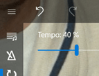
For your delight, below is a slideshow of significant changes the Chronotron user interface has gone through over its lifetime. There’s of course a slide for Release 109, and I’m sure it won’t be the last.
 Chronotron